Aside from the details of your office uniform, you also need to choose the best uniform colors for office wear. It may be tempting to just pick out anything trendy. However, it is important to remember that these outfits will be used for a long time and will become your company’s signature look. Make sure you pick a palette that is timeless and suits your brand perfectly. To help you decide, keep on reading!
Take inspiration from your company’s branding and let it guide you on your choice of colors.
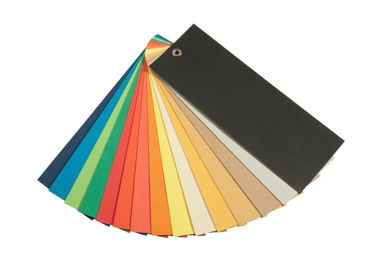
You can tell a lot about a company by its branding. A neutral monochromatic logo will give the impression of a minimalist or no-frills company. A colorful and bright one will instantly give the impression of fun and creativity. You can incorporate these colors into your company uniform depending on the message you want to come across to clients.

If you’re in a formal corporate environment, it is always safe to keep it simple by using neutral colors. For men and women, the classic choices are black, navy, and gray. These can be used in coats and pants, while the best color for blouses and button-ups is white. These are the easiest options you have if you want to keep it all about business and professionalism in the office.
Aside from these colors, beige and different hues of brown are also becoming a popular choices. Instead of full suits, these are commonly used in pants and skirts and paired with a white top. In more casual environments, you can get away with this option. It also has a more relaxed and calm feel.
If you want to send a fun and creative message to your clients, you should opt for bright hues. This can be reflected by your branding, and found in the logo itself. By doing this you can grab attention and your employees will embody the message that you want to convey. You can do this by assigning a color to each team, choosing a solid color for a polo shirt, or by putting a pop of color in the details.
To keep it tasteful, you can put bright colors on a pocket, button, or the lining of a uniform. Stick to solid hues if you can, so the uniform will look fun but also professional. If you decide to print a very colorful top, keep the bottoms neutral, so it doesn’t look excessive.

On the topic of color coordinating, you can always rely on pairing bright colors and neutrals together. Whether it’s a red tie with a black suit or a white jacket on a green dress — the combination of bold hues with muted ones will work.
For casual offices that allow denim jeans, you can pair a solid-colored polo. Denim bottoms look good with almost any top. You can also use the concept of contrast. If you have a dark top, choose light pants and dark shoes and vice versa. Advanced designers will also make use of monochromatic themes, but it requires experience to pull off.
Colors affect the moods of your employees and convey a message to clients. So before you select one, you should understand the symbolism associated with some of them. For example, black is commonly used in formal environments. This is because it has the aura of authority and knowledge. On the other hand, white looks clean and pure. This is the reason it is used by healthcare professionals.
Other colors you should learn more about are as follows:
This guide will help you choose the best uniform colors for the office. Whether you’re doing it for the first time or upgrading your company wear, take inspiration from your brand’s logo and opt for neutral or bright hues — depending on the formality of your working environment. Remember to color coordinate tastefully, and understand the symbolism behind each one to drive a powerful message to clients.
If you need additional assistance regarding your uniform design, you may send a message to Dels Apparel. They will guide you in choosing the best workwear for your needs. Click here!